Smooth Sun/Moon Animation with SVG Masks

Dark mode has thankfully become a fairly standard feature across the web over the past few years. While adding it to a recent webapp I was building, I wanted to create a slick little animated icon for the toggle button.
It turned out to be fairly straight-forward once you know how masking and clipping work in SVG, their differences and limitations.
Here's the final animation:
Basics
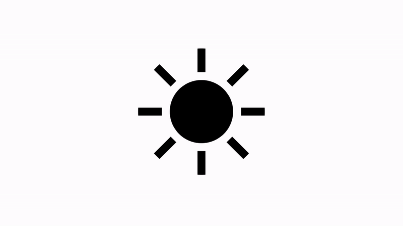
There are really only two elements in the base SVG before adding the masks: the center circle and the sun rays around it. Here's the basic setup:
<svg id="moon" viewBox="0 0 32 32">
    <circle id="sunbase" r="16" cx="16" cy="16"/>
    <path id="rays" d="M6,16l-6,0 M8.929,8.929l-4.243,-4.243 M8.929,23.071l-4.243,4.243 M16,26l-0,6 M27.314,27.314l-4.243,-4.243 M32,16l-6,0 M27.314,4.686l-4.243,4.243 M16,-0l-0,6"/>
</svg>
The center <circle> will form the basis of both the sun and moon. We'll be using a mask to 'cut out' an arc shape to create the typical crescent moon shape.
For the rays, rather than having a whole bunch of line elements clogging up the SVG code, the lines are all collected into a single <path> element. The basic syntax for drawing multiple elements is M[x,y]l[x,y] where M tells the imaginary drawing pen to 'move' to the following x/y coordinates, then lowercase l draws a 'line' to the second set of x/y coordinates. Each line drawn is separated by a single space.
Note that all coordinates here are relative to the initial point of 6,16 due to using a lowercase l - that's why there are negative numbers in there. Using an uppercase L instead would designate the coordinates as absolute, i.e. relative to the viewBox frame instead of the initial point.
Mask or Clipping Path
The changes being made to the shapes in this animation can be achieved with either a mask or a clipping path. Both use native SVG elements such as <path>, <circle>, <rect> etc, but masks can handle soft edges and semi-transparency while clipping paths can only make hard-edged cuts to shapes. Masks also have another important advantage that we'll get to in a minute. Both are easily defined within the <defs> tag at the top of the SVG.
To illustrate the difference, here are two examples which are visually identical, yet use different methods:
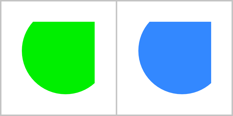
<svg id="clip-demo" viewBox="0 0 16 16">
    <defs>
        <clipPath id="clip1">
            <circle r="6" cx="9" cy="7"/>
        </clipPath>
    </defs>
    <rect width="10" height="10" x="3" y="3" fill="#38f" clip-path="url(#clip1)"/>
</svg>
<svg id="mask-demo" viewBox="0 0 16 16">
    <defs>
        <mask id="mask1">
            <circle r="6" cx="9" cy="7" fill="white"/>
        </mask>
    </defs>
    <rect width="10" height="10" x="3" y="3" fill="#0e0" mask="url(#mask1)"/>
</svg>
Both have a <rect> of the same size in the center, both are clipped/masked by a circle of the same size in the same position. The green square on the left uses a clipping path, while the blue square on the right uses a mask. Aside from the differences in tag names within the <defs> and the attributes applying them to their respective <rect>, the only difference is the requirement of a fill colour within the <mask> definition.
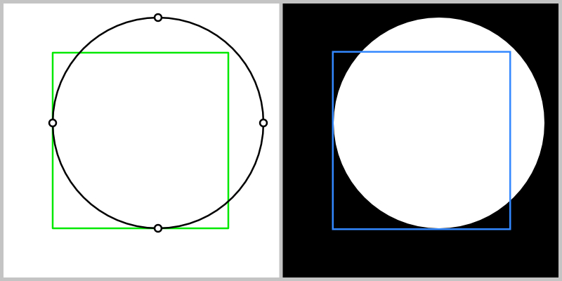
Below is what they might look like if you could 'see' the clipping path and the mask before they are applied to their shape. Note that the mask (right side) shows what is white and hides what is black. This is how they can handle smooth gradients of transparency between white (100% visible) and black (100% hidden), while the clipping mask is only a basic shape definition.
Which brings us to that important second advantage masks have - they can be inverted. While a clipping mask can only ever show what is inside itself, a mask can show either what is inside or outside itself.
Here is an example of the same mask being inverted, and the way this would look if you could 'see' the mask. The inverted mask is able to create a 'cut out' effect, which is exactly what we need to make the crescent moon shape.
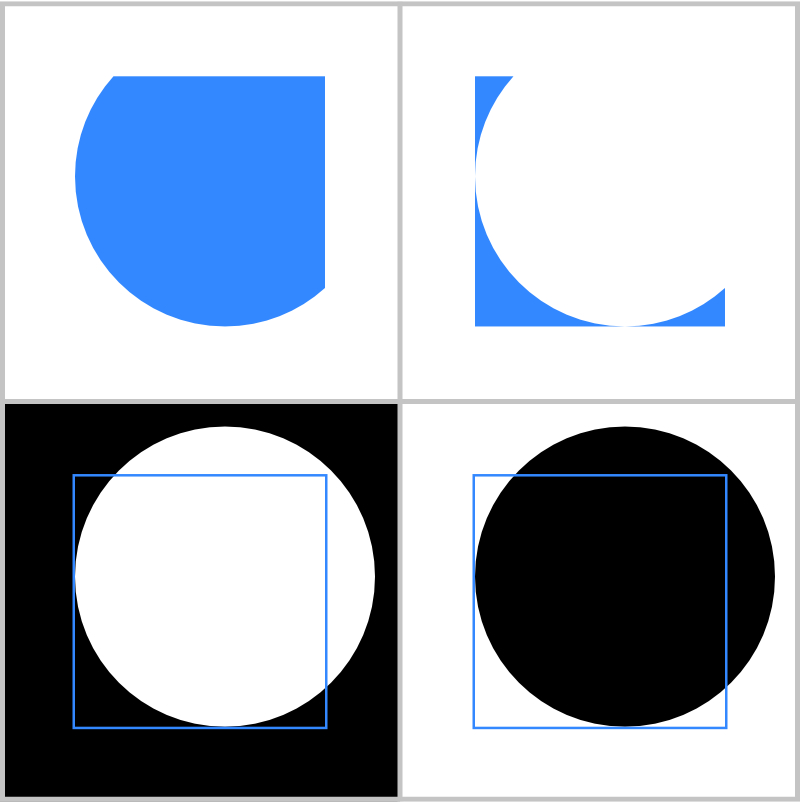
Here's the code for just the inverted mask on the right. This time the mask definition has two children, a white <rect> to make the whole image visible, and a black <circle> to 'cut out' a hole in the middle. The order is important here as elements are drawn in source order, placing the black circle above the white rectangle.
<svg id="mask-demo-inverted" viewBox="0 0 16 16">
    <defs>
        <mask id="mask2">
            <rect width="16" height="16" x="0" y="0" fill="white"/>
            <circle r="6" cx="9" cy="7" fill="black"/>
        </mask>
    </defs>
    <rect width="10" height="10" x="3" y="3" fill="#38f" mask="url(#mask2)"/>
</svg>
Moon and Sun
Time to apply this to the shapes to start creating our animation for the 'light' and 'dark' states. You'll remember that we only had two elements in the main SVG: a circle which will act as the center of the sun as well as the base for the moon shape, and the path with all the sun rays. Here's the same code from the beginning, this time wrapped in a simple HTML page:
<!DOCTYPE html>
<html lang="en">
<head>
    <meta charset="utf-8">
    <meta name="viewport" content="width=device-width, initial-scale=1">
    <title>Sun-Moon Animation</title>
    <style type="text/css">
        /* styles will go here */
    </style>
</head>
<body>
    <svg id="sunmoon" viewBox="0 0 32 32">
        <circle id="center" r="8" cx="16" cy="16"/>
        <path id="rays" d="M6,16l-6,0 M8.929,8.929l-4.243,-4.243 M8.929,23.071l-4.243,4.243 M16,26l-0,6 M27.314,27.314l-4.243,-4.243 M32,16l-6,0 M27.314,4.686l-4.243,4.243 M16,-0l-0,6"/>
    </svg>
</body>
</html>
For simplicity's sake, we'll ignore clipping paths and use a mask on both the rays and the center, then use CSS to style and animate them.
Firstly, getting the masks set up means creating a new <defs> element as the first child of the SVG and adding two mask elements, here given the id of maskc and maskr for the center mask and ray mask, respectively. Then apply them to their target elements using the mask="url(id)" attribute that we saw in the examples above.
<svg id="sunmoon" viewBox="0 0 32 32">
    <defs>
        <mask id="maskc">
            <rect x="0" y="0" width="32" height="32" fill="white"/>
            <circle id="mask-center" cx="40" cy="16" r="8" fill="black"/>
        </mask>
        <mask id="maskr">
            <circle id="mask-rays" cx="16" cy="16" r="16" fill="white"/>
        </mask>
    </defs>
    <circle id="center" mask="url(#maskc)" r="8" cx="16" cy="16"/>
    <path id="rays" mask="url(#maskr)" d="M6,16l-6,0 M8.929,8.929l-4.243,-4.243 M8.929,23.071l-4.243,4.243 M16,26l-0,6 M27.314,27.314l-4.243,-4.243 M32,16l-6,0 M27.314,4.686l-4.243,4.243 M16,-0l-0,6"/>
</svg>
To transition to the moon icon, we're going to be animating three parts: the center will grow bigger, the mask-center will move in from the right to cut out part of the center circle, and the mask-rays will shrink from the center to hide the rays path.
Setting up the styling and transitions in CSS looks like this:
#center,
#mask-rays,
#mask-center {
    transform-origin: center;
    transition: transform 250ms ease-out;
}
#center {
    fill: #000;
    transform: rotate(-35deg);
}
#rays {
    stroke: #000;
    stroke-width: 2px;
}
All three animating elements share the same transform-origin and transition type, so they're grouped under a single definition. Everything is pretty straight-forward except that the #center element has an additional rotate() transform applied so that the final moon shape is leaning at an angle. This will also affect that element's mask.
For the dark mode, we will simply add a class of dark to the <body> element, triggering these styles:
body.dark #center {
    transform: rotate(-35deg) scale(2);
}
body.dark #mask-rays {
    transform: scale(0.5);
}
body.dark #mask-center {
    transform: translateX(-18px);
}
Now when the body element has a class of dark, all three animations will trigger, using the transition we just applied above.
Note that we have to repeat the rotate() transform for the #center state so that it stays at an angle and add the scale() transform after it. The #mask-rays shrinks to half its original size, and the #mask-center slides in from the right, masking the center element to create the moon crescent shape.
Interaction
So far we haven't had any way to trigger the transition between the two states. Let's fix that with a tiny bit of JavaScript just for demo purposes. In a real application, this would naturally be connected to a larger series of events to trigger dark mode, but let's add this in a <script> tag at the bottom of the page:
<script>
    document.body.addEventListener('click', () => {
        document.body.classList.toggle('dark')
    }, false);
</script>
Now clicking anywhere on the page will trigger the animation between the two states. Easy!
Wrapping Up
We learned a little bit about SVG paths, the differences between masks and clipping paths, how to invert a mask, and use simple CSS transitions to animate everything. You can see my final version in action in the top-right corner of the little Multi-Currency Converter I made recently.
Thanks for following along, and let me know if you're able to use any of this in your own projects.
