A Generative Mondrian with CSS Grid
Use CSS Grid Layout and a little JavaScript to recreate the iconic grid paintings of Piet Mondrian.

Getting to grips with CSS Grid Layout can be confusing. The new syntax, the new shorthand and an almost entirely new way of thinking about layouts when coming from earlier CSS.
From the beginning, one of the best resources out there was the Grid by Example site by Rachel Andrew, and especially her accompanying video series gently walking you through the basics.
In the video 'Auto-placement explained' from that series, she demonstrates a layout that will remind many wisened front-end devs of the original, JavaScript-based Masonary grid layout library and its offspring like Isotope and Packery. Apparently this is now also known to some as the 'Pinterest Style' layout.
It also reminded me of Piet Mondrian's famous grid paintings. I am a man of culture.
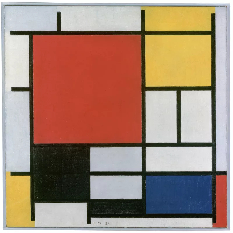
Piet Mondrian, Composition with Large Red Plane, Yellow, Black, Grey and Blue, 1921
The Plan
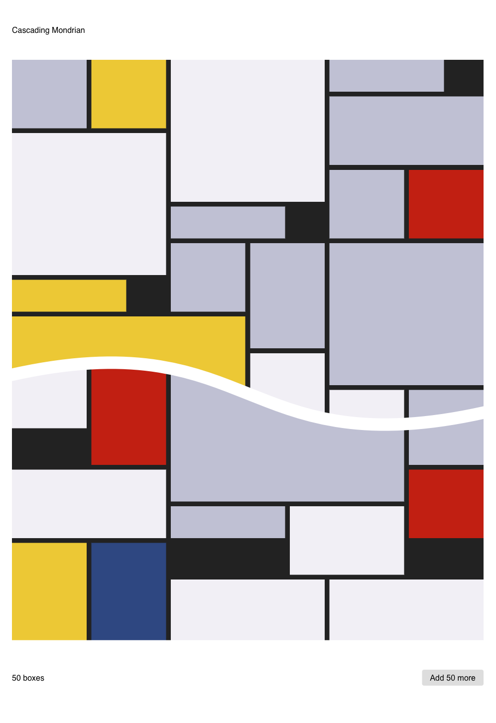
We're going to make a replica of these iconic images using CSS Grid for layout and a little JavaScript to generate the DOM elements. Here's my final version.
The page will randomly generate boxes of different sizes and colours then drop them into a grid container, allowing CSS Grid to do the work of packing them together, aka 'back-filling'.
We'll need to use a weighted random algorithm to try and emulate the density and feel of a Mondrian, while using colours sampled directly from some of his works. I'll be using the images on pietmondrian.info as reference.
It would be possible to make the grid of boxes scroll infinitely, adding a new batch every time the end of the page is reached. But I'm not a fan of infinite scroll so instead will make this a manual, user-initiated process. We'll need a button and some simple interaction code for that.
The Layout
The base HTML is as simple as can be. Just a main wrapper with a #grid element to hold all the boxes that we'll generate later.
<body>
    <main>
        <div id="grid"></div>
    </main>
</body>
But before we dive into generating them with JavaScript, let's get the visuals looking right. To that end, add a few dummy boxes into our #grid element to develop the styling. We'll remove these later.
<body>
    <main>
        <div id="grid">
            <div class="box size2x2 white"></div>
            <div class="box size2x3 red"></div>
            <div class="box size3x1 grey"></div>
            <div class="box size3x2 white"></div>
            <div class="box size4x2 yellow"></div>
            <div class="box size4x4 blue"></div>
            <div class="box size6x6 grey"></div>
        </div>
    </main>
</body>
Here's where we need to start making decisions about colours and sizes. I settled on seven different sizes and five different shapes. Add enough dummy .box divs to cover all the sizes you'll use, and make sure you've got all the colours covered too. No need to add all possible combinations, of course.
Moving over to the CSS, let's get the colours set up first. Here are the ones I chose from the source images:
.red    { background-color: #c11f12; }
.yellow { background-color: #ecc835; }
.grey   { background-color: #bfc0d4; }
.white  { background-color: #f1eff5; }
.blue   { background-color: #2d4781; }
Finally it's time to implement some CSS Grid:
#grid {
    display: grid;
    grid-auto-flow: dense;

    grid-template-columns: repeat(auto-fill, minmax(2rem, 1fr));
    grid-auto-rows: minmax(2rem, auto);

    grid-gap: 0.5rem;
}
The first line here designates #grid as a CSS Grid element, with grid-auto-flow set to pack its children as densely as possible, back-filling available space.
The next two lines set up our grid. For the column tracks, we're using the new repeat() function that can be used with both grid-template-columns and grid-template-rows. The first argument is how many tracks to add, and here auto-fill will add as many of the given size (width in this case) as can fit into the available space. The second argument uses another new function, minmax() for the size argument, setting a minimum column width of 2rem and a maximum of 1fr.
This fr is a new flexible unit type, short for the number [fr]actions of the size of the container element. So if 10 columns can currently fit in the container, this will be equal to 1/10 of the width of the container. If we change it to 3fr it'll be equal to 3/10 and so on. Alternatively, if the container grows to fit 13 columns, this 1fr will be equal to 1/13 of the width of the container.
The following line utilises the grid-auto-rows instead of the column-equivalent grid-template-rows to allow the grid to fill automatically. The row height is set to the same 2rem as the columns and auto-fills its container.
Finally, we add a gap between all grid tracks (both columns and rows) with the self-explanatory grid-gap definition.
Next, the box sizes:
.size2x2 { grid-column-end: span 2; grid-row-end: span 2; }
.size2x3 { grid-column-end: span 2; grid-row-end: span 3; }
.size3x1 { grid-column-end: span 3; grid-row-end: span 1; }
.size3x2 { grid-column-end: span 3; grid-row-end: span 2; }
.size4x2 { grid-column-end: span 4; grid-row-end: span 2; }
.size4x4 { grid-column-end: span 4; grid-row-end: span 4; }
.size6x6 { grid-column-end: span 6; grid-row-end: span 6; }
This new syntax is also fairly self-explanatory. Each box should span the given number of columns and rows using the grid-column-end and grid-row-end definitions.
Finally some media queries to allow the grid to expand:
@media (min-width:600px) {
    #grid {
        grid-template-columns: repeat(auto-fill, minmax(4rem, 1fr));
        grid-auto-rows: minmax(4rem, auto);
        grid-gap: 0.6rem;
    }
}
@media (min-width:1200px) {
    #grid {
        grid-template-columns: repeat(auto-fill, minmax(7rem, 1fr));
        grid-auto-rows: minmax(7rem, auto);
        grid-gap: 0.75rem;
    }
}
That's it for the basics of the CSS. We'll come back and add some finishing touches later, but now it's time to move onto the generative logic.
Generating Boxes
Starting on the JavaScript, we'll just need to store a reference to the #grid DOM element and then make a couple of arrays to hold the above colour and size CSS classes that we can randomly select from. We'll also set a maximum number of boxes to add per generation, as well as a counter variable to keep track of the total number of boxes added to the grid.
const grid = document.getElementById('grid');
const colors = ['blue','red','yellow','grey','white'];
const sizes  = ['size2x2','size2x3','size3x1','size3x2','size4x2','size4x4','size6x6'];
const max = 50;
let count = 0;
From here we just need a function to make each box, and another to add the boxes to the grid.
function makeBox() {
    const box = document.createElement('div');
    box.classList.add(
        'box',
        colors[ Math.floor( Math.random() * colors.length )],
        sizes[ Math.floor( Math.random() * sizes.length )]
    );
    return box;
}
To make each box, we simply create a div, add a few classes and return it. It's possible to add multiple classes in a single call of classList.add() using a comma-separated list. We first give it a class of box and choose a random colour and size using Math.random(). This is a 'dumb' random choice with no weighting, resulting in a random integer that is less than the length of the array. This random number is used as the index to select a CSS class from each array.
function addBoxes() {
    let frag = document.createDocumentFragment();
    for (let i = 0; i < max; i++) {
        count++;
        const box = makeBox();
        frag.appendChild(box);
    }
    grid.appendChild(frag);
}
To add the boxes to the grid, we make a DocumentFragment to hold all our boxes outside the DOM as they are generated, rather than adding them to the DOM one by one. We run a simple for loop that stops at the amount value, and inside we increment the count, then call makeBox() and append its output to the fragment. Once that loop has finished we add them all to the page at once using appendChild.
With only a couple of arrays and two functions, we're ready to generate some Mondrians! Go ahead delete the hard-coded dummy .box divs inside the #grid in the HTML, then call the addBoxes function at the bottom of your script, like so:
addBoxes();
If all went to plan, you should see something like this:
Weighting the Random
Each time you refresh the page you'll get another random grid. But there will be too many red boxes or too few large boxes to really capture the feel of the original source material. Here is where 'weighting' the items is how we adjust the amount of each size or colour to better reflect the feel of an original Mondrian. But we'll need one more function and some more data for our classes.
First, let's replace the original two arrays colors and sizes with these objects:
const colors = {
    'blue': 0.05,
    'red': 0.07,
    'yellow': 0.13,
    'grey': 0.35,
    'white': 0.40
};

const sizes = {
    'size2x2': 0.25,
    'size2x3': 0.15,
    'size3x1': 0.2,
    'size3x2': 0.1,
    'size4x2': 0.1,
    'size4x4': 0.15,
    'size6x6': 0.05
};
Each item is assigned a decimal between 0 and 1, and the total adds up to 1. These tell the random function how much 'weight' it should have, or how likely it is to be selected. These are the numbers I settled on after some fiddling, but feel free to play around. Just make sure that the total of all the weights is equal to 1.
function randomWeighted(table) {
    let i, sum = 0, r = Math.random();
    for (i in table) {
        sum += table[i];
        if (r <= sum) return i;
    }
}
I'm no expert on rejection sampling or algorithmic performance, so this is just a simple technique adapted from this SO answer. But this is a deep and fascinating rabbit-hole that you are welcome to delve into at your leisure. This works well and is fast enough for such a simple task.
Now it's just a matter of plugging this into our box-maker function from before in place of the Math.random() calls we used earlier:
function makeBox() {
    const box = document.createElement('div');
    box.classList.add(
        'box',
        randomWeighted(colors), // set random color
        randomWeighted(sizes) // set random size
    );
    return box;
}
With weighting implemented, you should have something with a density and colour spread closer to that of our source. Still random and changing with each page refresh, but much better than pure randomness.
Box Spawner
Time to add is some page structure and a little interactivity. Just a simple button which adds more boxes to the grid and some text to display a running total of how many we already have. Add these in a footer below the grid, and a header above for a title, and your final HTML should look like this:
<body>
    <main>
        <header><h1>Cascading Mondrian</h1></header>
        <div id="grid"></div>
        <footer>
            <p><span id="txt-count">0</span> boxes</p>
            <button id="btn-more"></button>
        </footer>
    </main>
</body>
Back in the JavaScript, let's grab a reference to those two new DOM elements along with the grid, making the top of the script looks like this:
const grid      = document.getElementById('grid');
const btn_more  = document.getElementById('btn-more');
const txt_count = document.getElementById('txt-count');
At the bottom of the script just above the initial addBoxes() call, link the button up the to that function with a simple click event listener, then set its text to show how many boxes will be added:
btn_more.addEventListener('click', addBoxes, false);
btn_more.innerText = `Add ${max} more`;
Finally, make addBoxes() update the box count text by adding this line at the bottom of that function:
txt_count.innerText = count;
And that's the end of the JavaScript. Here it is all together:
const grid      = document.getElementById('grid');
const btn_more  = document.getElementById('btn-more');
const txt_count = document.getElementById('txt-count');
const max = 50;
let count = 0;

const colors = { 'blue': 0.05, 'red': 0.07, 'yellow': 0.13, 'grey': 0.35, 'white': 0.40 };
const sizes = { 'size2x2': 0.25, 'size2x3': 0.15, 'size3x1': 0.2, 'size3x2': 0.1, 'size4x2': 0.1, 'size4x4': 0.15, 'size6x6': 0.05 };

function randomWeighted(table) {
    let i, sum = 0, r = Math.random();
    for (i in table) {
        sum += table[i];
        if (r <= sum) return i;
    }
}

function makeBox() {
    const box = document.createElement('div');
    box.classList.add(
        'box',
        randomWeighted(colors),
        randomWeighted(sizes)
    );
    return box;
}

function addBoxes() {
    let frag = document.createDocumentFragment();
    for (let i = 0; i < max; i++) {
        count++;
        const box = makeBox();
        frag.appendChild(box);
    }
    txt_count.innerText = count;
    grid.appendChild(frag);
}

btn_more.addEventListener('click', addBoxes, false);
btn_more.innerText = `Add ${max} more`;

addBoxes();
Finishing Up
Finally, let's tidy up the page with a little more CSS. Add this to the grid, colour and @media definitions we set up in the layout section above:
body {
    font: 16px/1.5 sans-serif;
    display: flex;
    flex-direction: column;
    align-items: center;
    margin: 2rem;
}

h1 {
    font-size: inherit;
    font-weight: normal;
    margin: 0;
}

main {
    width: 100%;
    max-width: 80rem;
}

header {
    padding: 1rem 0 3rem 0;
}

footer {
    display: flex;
    flex-direction: row;
    justify-content: space-between;
    align-items: center;
    margin: 3rem 0;
}

#btn-more {
    padding: 0 1rem;
    line-height: 2;
    font-size: inherit;
    border: none;
    border-radius: 0.25rem;
    background-color: #ddd;
    cursor: pointer;
}
Using flexbox with flex-direction: column on the body allows us to easily align the main wrapper in the middle of larger screens using align-items: center, as long as the width of main is set to be 100% otherwise it'll get squashed up in the middle.
The footer also uses flexbox (in the default row direction) and justify-content: space-between to push its two child items to opposite sides without fiddling about with float or any other positioning code. A little boilerplate for the body and some styling for the button, and you're all done.
Time to get out there and show everyone how cultured you are with your new Generative Mondrian project. Here's mine in case you missed it.
Thanks for reading.
Further reading
Grid by Example: site and video playlist
Max Halford: Grid paintings à la Mondrian with JavaScript (also Github)
Mozilla: Masonry layout in CSS
CSS Tricks: Approaches for a CSS Masonry Layout
SitePoint: Understanding Masonry Layout
